
TL;DR:
- A mobile-friendly school website loads quickly, displays correctly, and functions fully on any device. Schools with optimized mobile sites see increased parental engagement, inquiries, and higher search rankings. Prioritizing mobile usability enhances reputation and ensures equitable access for all users.
A mobile-friendly school website is defined as a site that loads quickly, displays correctly, and functions fully on any smartphone or tablet. The importance of mobile-friendly school websites has moved well beyond a technical preference. It is now a core requirement for schools that want to communicate effectively, support admissions, and meet the expectations of parents and students who access information on the move. Standards such as WCAG AA accessibility guidelines and Google’s mobile-first indexing have made responsive, performant design a baseline, not a bonus. Schools that treat mobile usability as an afterthought risk losing parent trust, search visibility, and enquiry conversions before a single conversation takes place.
Why mobile-friendly school websites matter for engagement
Mobile devices now dominate school website traffic, and the majority of parents reach your site through a smartphone rather than a desktop. Mobile experience is the primary user interface for school communication and research in 2026. That shift changes what good design means. A site that looks polished on a widescreen monitor can be completely unusable on a mid-range Android phone with a 4G connection.

The benefits of mobile-friendly websites for schools are measurable. Mobile-optimised school sites see up to a 40% increase in admission enquiries and double the time parents spend engaging with content. Those are not marginal gains. They represent the difference between a prospective family completing an enquiry form and abandoning the site in frustration.
Accessibility is equally critical. Accessible mobile sites must meet WCAG AA minimum contrast ratios and support screen readers to serve users with disabilities. For schools, this is both a legal responsibility and a practical one. Parents with visual impairments, dyslexia, or motor difficulties rely on accessible design to engage with school communications on equal terms.
Key elements that determine whether a mobile site genuinely serves parents and students include:
- Touch targets sized at least 44px tall so buttons and links are easy to tap without errors
- Form fields set to at least 16px font size to prevent auto-zoom on iOS and Android devices
- Streamlined navigation with no more than five top-level menu items visible on a small screen
- Readable body text at a minimum of 16px with sufficient line spacing for comfortable reading
- Fast-loading images that do not consume mobile data unnecessarily
Pro Tip: Test your school website on a mid-range Android device rather than the latest flagship phone. Budget devices expose layout breaks, slow load times, and tap-target failures that premium hardware masks entirely.
How does site speed affect your school website’s performance?
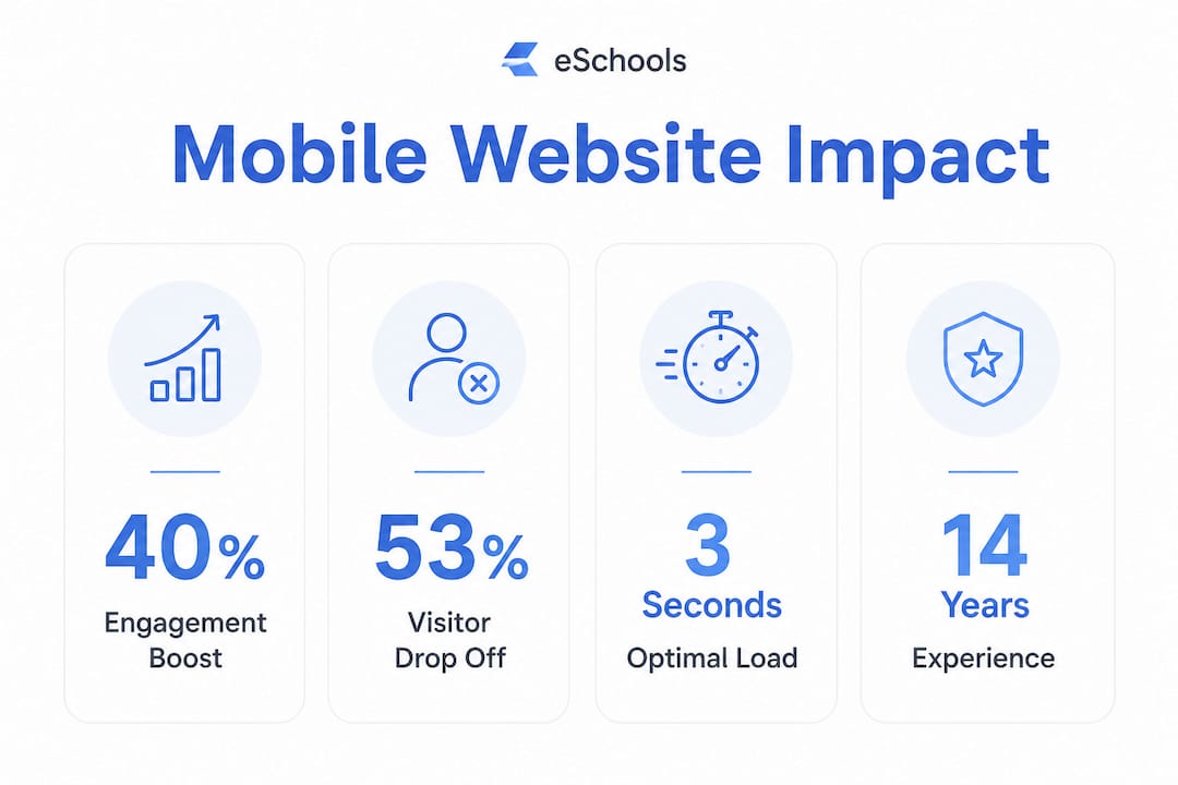
Over 53% of visitors abandon a mobile page that takes longer than three seconds to load on a 4G connection. That figure applies directly to parents searching for your school during an admissions window or trying to access a newsletter link at the school gate. Every second of delay costs you audience.
Speed is not just a user experience concern. Google uses the mobile version of a site for ranking and penalises slow, cluttered mobile pages in search results. A school website that performs poorly on mobile will rank lower than a competitor site that loads cleanly, regardless of how much content or how many pages it contains. Mobile-first indexing means your mobile site is your site, in Google’s view.
A one-second delay in load time correlates with a measurable drop in conversion rates. For schools, a conversion is a parent completing an enquiry form, downloading a prospectus, or booking a tour. Slow pages directly reduce the number of families who complete those actions.
Technical best practices that address load speed include compressing and correctly sizing images before upload, reducing the number of HTTP requests by combining scripts and stylesheets, and applying progressive enhancement so core content loads first. Tools such as Google PageSpeed Insights and Lighthouse provide free, detailed audits that identify exactly which elements are slowing your site down.
Pro Tip: Run a Lighthouse audit on your school’s homepage from a throttled 4G connection setting. The results will show you what a parent on a busy commute actually experiences, not what you see on your office broadband.
Common mobile usability mistakes schools make
Responsive design is not the same as mobile usability. Many school websites use a responsive framework that technically adapts to different screen sizes, yet still deliver a poor experience because the underlying design decisions were made for desktop. The layout reflows, but the touch targets remain too small, the forms are difficult to complete, and the navigation collapses into a menu that is hard to find.
The most frequent mistakes fall into four categories:
- Small touch targets. Touch targets smaller than 44px cause tapping errors and frustration. Buttons for key actions such as “Contact Us” or “Apply Now” must be large enough to tap accurately with a thumb.
- Auto-zoom on form fields. Form fields set below 16px font size trigger automatic zoom on iOS devices. Parents filling in an enquiry form on a phone should not have to pinch and scroll to complete basic fields.
- Cluttered navigation. Desktop menus with ten or more items become unusable when collapsed into a mobile hamburger menu. Parents cannot find what they need quickly, and they leave.
- Untested on real devices. Testing on low-end Android devices is critical because high-end desktops and premium phones mask severe performance issues. The parent experience on a three-year-old budget phone with a throttled connection is the experience that matters most.
A further oversight is treating accessibility as a separate project from mobile optimisation. The two are inseparable. WCAG AA compliance addresses colour contrast, keyboard navigation, and screen reader support. These requirements overlap directly with mobile usability because many assistive technologies are used on mobile devices. Integrating accessibility into mobile design from the outset is far more efficient than retrofitting it later.
Pro Tip: Use Chrome DevTools’ device emulation alongside real device testing. Emulation is useful for quick checks, but it does not replicate the processing speed, touch sensitivity, or network variability of an actual budget smartphone.
Practical steps to make your school website truly mobile-friendly
Assessing your school website’s mobile readiness requires a structured approach. Four areas demand attention: performance, accessibility, content relevance, and navigation. Addressing each in turn produces a site that genuinely serves parents and students rather than one that merely passes a basic responsiveness check.
Performance and accessibility
Run Google PageSpeed Insights and Lighthouse audits on your homepage and your most visited pages, typically the admissions page, contact page, and term dates. Aim for a Lighthouse performance score above 90 on mobile. Address the specific issues flagged, starting with image compression and render-blocking scripts. For accessibility, use an automated checker alongside manual testing with a screen reader such as VoiceOver on iOS or TalkBack on Android.
For a broader mobile website relaunch checklist, structured frameworks covering performance, content, and technical requirements provide a useful starting point that school teams can adapt to their specific context.
Content and navigation
Content written for desktop often fails on mobile because paragraphs are too long, calls to action are buried, and key information requires excessive scrolling. Mobile-adapted content leads with the most important information, uses short paragraphs, and places calls to action prominently above the fold. Enquiry forms should ask for the minimum information needed to make initial contact. Every additional field reduces completion rates.
Navigation on mobile must be simple and predictable. A sticky header with a clearly visible menu icon, a prominent phone number or contact button, and a search function covers the needs of most parents visiting a school site. Avoid dropdown menus that require precise hovering, as they do not translate to touch interfaces.
The table below summarises the key assessment areas and what good practice looks like for each:
| Assessment area | Good practice standard |
|---|---|
| Load speed | Under 3 seconds on a 4G connection; Lighthouse score above 90 |
| Accessibility | WCAG AA compliance; screen reader compatible; minimum 4.5:1 contrast ratio |
| Touch usability | All targets at least 44px; form fields at least 16px font size |
| Navigation | Five or fewer top-level items; sticky header; visible search function |
| Communication | One-tap contact options including WhatsApp click-to-chat from every page |
Pro Tip: Place your most important call to action, whether that is a tour booking link or an enquiry form, within the first screen of content on mobile. Parents who have to scroll to find it often do not.
Integrating direct communication options strengthens mobile usability further. A WhatsApp click-to-chat button accessible from every page removes friction for parents who want an immediate answer. Pairing this with a dedicated school mobile app extends that communication beyond the website and into a channel parents already use daily.
Key takeaways
A school website that performs well on mobile is the single most effective tool for improving parent engagement, supporting admissions, and meeting accessibility obligations in 2026.
| Point | Details |
|---|---|
| Speed is non-negotiable | Over 53% of visitors leave if a page takes more than 3 seconds to load on mobile. |
| Responsive design is not enough | Touch targets, form field sizes, and navigation must be explicitly designed for mobile use. |
| Accessibility and mobile overlap | WCAG AA compliance addresses requirements that directly improve the mobile experience for all users. |
| Test on real budget devices | Premium phones and desktop emulators mask the performance issues most parents actually encounter. |
| Mobile drives admissions | Mobile-optimised sites see up to a 40% increase in admission enquiries compared to non-optimised equivalents. |
The case for treating mobile as your school’s front door
School leaders often tell me they have a “mobile-friendly” website because their platform uses a responsive theme. That claim deserves scrutiny. Responsive means the layout adapts. It does not mean the experience is good. I have reviewed school sites that reflow correctly on a phone yet take eight seconds to load, present a contact form with fields so small they trigger auto-zoom, and bury the admissions link three taps deep in a collapsed menu. Technically responsive. Practically unusable.
The schools that gain a real advantage in competitive admissions markets are the ones that treat mobile as the primary experience, not a scaled-down version of the desktop site. That means designing navigation for thumbs first, writing content for a five-inch screen first, and testing on a £150 Android phone first. The desktop experience follows from those decisions, not the other way around.
What I find most underestimated is the reputational signal a poor mobile site sends. Parents form an impression of a school’s organisation and care within seconds of landing on its website. A slow, cluttered, or inaccessible mobile site communicates the opposite of what most school leaders intend. The school website design choices you make today are the first impression you make on every prospective family who searches for you on their phone.
Continuous evaluation matters as much as the initial build. Mobile standards, device capabilities, and parent expectations shift. A site that performed well in 2023 may now fall short of WCAG AA requirements or Google’s Core Web Vitals thresholds. Schedule a structured mobile audit at least once per academic year and act on the findings.
— Ed
How Eschools helps schools build websites that work on every device
Eschools has spent over 14 years building websites specifically for schools and multi-academy trusts, with mobile performance and accessibility built into every project from the outset.

If your current site is losing parents at the first tap, Eschools’ school website solutions are designed to change that. Every site Eschools builds meets WCAG AA accessibility standards, loads quickly on mobile connections, and presents your school’s most important information clearly on any device. You can see the results across a range of schools in the Eschools project portfolio. For school leaders ready to give their community a website that genuinely serves them, Eschools provides the expertise, support, and tools to make that happen without the complexity.
FAQ
Why is mobile-friendliness critical for school websites?
Mobile devices are the primary way parents and prospective families access school information. A site that performs poorly on mobile loses visitors, reduces enquiry conversions, and ranks lower in Google search results due to mobile-first indexing.
What load speed should a school website achieve on mobile?
A school website should load in under three seconds on a 4G connection. Pages that exceed this threshold see abandonment rates above 53%, meaning more than half of mobile visitors leave before the page finishes loading.
What does WCAG AA compliance mean for school websites?
WCAG AA is the Web Content Accessibility Guidelines standard at level AA. It requires minimum colour contrast ratios of 4.5:1, screen reader compatibility, and keyboard-navigable interfaces. Meeting this standard makes your site accessible to users with disabilities and supports legal compliance.
How do I test whether my school website is truly mobile-friendly?
Use Google PageSpeed Insights and Lighthouse for performance and accessibility audits. Supplement these with manual testing on a mid-range or budget Android device using a throttled 4G connection to replicate the experience most parents actually have.
Does a responsive website automatically meet mobile usability standards?
No. Responsive design ensures a layout adapts to different screen sizes, but it does not guarantee usable touch targets, readable form fields, fast load times, or accessible content. Mobile usability requires deliberate design decisions beyond responsiveness alone.